Product listing pages are the most explored pages on your eCommerce site. The display of your products on listing pages is a place where your customers enjoy organizing their favorite products in a way they understand, for example showing the newest, blue products that are for swimming. A good product listing page will give the customer a variety of ways to organize products to enable them to find what they are looking for or find something that they may not have found otherwise.
The listing pages are pages that increase engagement. Making sure your team sets it up exactly right will help to avoid latency and provide a wonderful experience.
Here are a handful of items that you should review or include within your listing pages:
Pagination
Pagination will add depth to your pages allowing your customers to get to a certain page fast by including a sequence of page numbers like this:

Left Navigation Filters
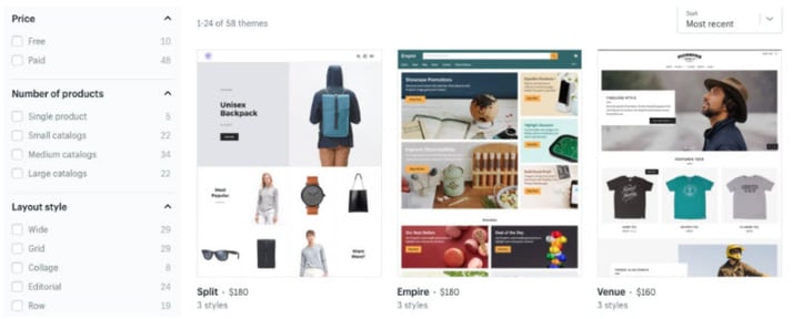
Adding navigation to the left column of your listing page will enable quick searching for your customers, by adding short links to your products by category. Some common categories found in the left navigation can include color, size, product category and price. You may also want to add a few facets that describes products in more specific ways, for example 100% cotton or Organic.
The other wonderful thing about the left navigation is that it can be pulled into your hamburger menu on your mobile device, making the mobile experience more robust.

Multiple Images per Product
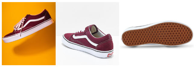
Also remember to add images that show your products in the best light, consider adding two images per product that change on hover. This adds to the PC experience, for the mobile experience consider using an image that shows as much detail as possible within a small image frame.

Ratings
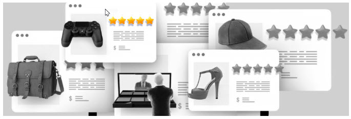
One of the quickest converting adds are rating indicators, such as stars. By showing higher ratings your customers will tend to select the product based on its hi rating. You can also add tags to your higher rated products to enable your customers to search for the product-based n ratings.

Pricing
Clear pricing is always necessary, also consider showing the original price versus current selling price. One way to handle sale pricing is to make the current price bold while fading the original price with a strike through to avoid looking like this.

Product Badges
Product badging can be fun and can add an extra flare to the product, some badges that are commonly used are: ‘NEW,’ ‘Just in,’ ‘Hot,’ ‘Clearance.’ Don’t get too carried away when you use badges, use them sparingly to make the products that you would like to move that week or month.

For other areas of your site to optimize, read our blog about the Top 52 Ways to Optimize Your Site.
Interested in learning more? Checkout the second part to this blog series. Part 2

