The second part of this series is a list of items that are essential to have on your product detail pages. Have you ever received a product and discovered that the fit was just, not right? Maybe it was the material or the weight or size? Whatever the issue, communicating what you are selling online takes focus and a little extra time when merchandising.
Optimizing your website and making product pages user friendly is an essential practice for your ecommerce business. Here are a handful of things that you should consider when creating a process to merchandise your products on your website.
Imagery
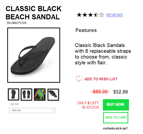
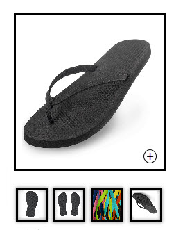
One of the most important pieces of your product detail pages are images. The size and quality of your images will impact how your product is perceived by your customers. For example, if you have too large of an image file, prepare for delays when your product loads. Also, if your image is too small or too low resolution expect your image to look fuzzy and even pixelated.
Make sure you have an image set for desktop and mobile. Keeping only one set of images will cause your mobile experience to be slow or your desktop imagery to appear fuzzy.

Size chart and Color Options
One of the biggest deterrents of buying online is the fit and real look of the product. Including a descriptive size chart for your products goes a long way. Also getting your color options to display as close to real life as possible is a key to a successful buying experience.
Descriptions – Size, Color, Material, and Features
When creating descriptions try reading the description to a friend (tell them to keep their eyes closed). The idea is that your description can create a picture in the buyers' mind. Make sure to include, color, material and any features that help describe the item. If the item fits tight or over-sized as a fashion preference, be sure to mention it. One example would be found when buying jeans, they use descriptions like slim fit, baggy or straight fit. Do not be afraid to have fun with your descriptions it can also add to the strength of your branding.
Brand Story or Details
Branding is a key to connecting with your customers. Including your brand story and be authentic it can be an inspiration to your customers.
Pricing
A clear view of how much an item costs makes it easier for your customer to decide on whether to buy or not. You may also consider showing the original price if there is a sale, just make sure to put the current price on top and make is bold or make the original price fade or include a strike through.

Cross Selling
Only you and your team know what you have in stock. Including cross sells can save your customers time and may also expose them to more items that they may have not thought of before. Adding a few items below your product makes sense. Consider including 3 or more cross sell products.
Goes With, or Complete the Look
Accessorizing is, and will always be, a thing. Keep your customers in tune with trends to help them accessorize. For example, if your customer is buying board shorts to head to the beach, you may want to include shades, flip flops, beach towels or even a second pair of board shorts in a different color.
Noticeable Add to Cart Button
Make it easy for your customers to add the item to their cart, use bold letters or an easy to find add to cart button that is located above the fold. If you have a cart button, is it the right color? Or size? This may be an opportunity for an A/B test.

Store Availability
Connect your eCommerce site to your brick and mortar store by including in store availability. This can increase the speed of the sale if it makes it convenient, less expensive, or more quickly available for your customer.
Reviews
Build trust and loyalty, your customers reviews also describe what sets your products apart from others. Product reviews from your customers is a great add for any site.
SKU or ID Number
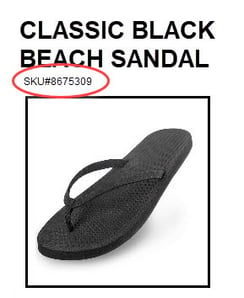
Including SKU and Style ID numbers may not make much sense for your customers but can help your team verify a product when returning, exchanging, or ordering the item.

Image Zoom Features on PC
Including a Zoom feature on desktop may seem like overkill but is still a great tool to improve the experience your customers have.
Breadcrumbs
Navigating through your site should be created in a way that helps your customers find where they were or what they need. Adding breadcrumbs just below your navigation or just above your product can improve their experience and speed up their time to cart.
These are only a handful of things to consider. If you have all these items checked off and would like to learn check out the third part to this series. Part 3

