In the third part of this blog series we will focus on the essential home page attributes to help your site increase conversions. Our team has reviewed thousands of home pages in the past two decades, here are 19 areas to focus on and some tips that work.
Hero Banners / Ads
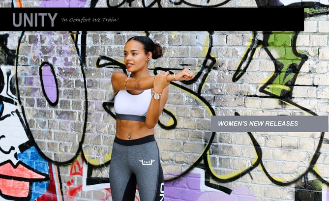
Hero Banners sit front and center on your home page, right under your main navigation and are there to drive traffic to specific pages on your site. In many cases eCommerce sites drive traffic to product listing pages that have new products or best sellers.

Live Chat
The connection between you and your customers has changed and the ability to chat with an attendant on your team is now a standard. Consider adding your chat link or pop ups to your homepage, but also consider adding it to your contact us page and customer service page.
Top and bottom Navigation
Your top and bottom navigation should include pathways to handle business, this means buying and returns, but also your main categories of products, hours of operation and location details.
For your bottom navigation, consider Including links to company Information that includes terms of use and your privacy policy, account login, customer service/returns, shipping and delivery details, FAQ’s, payment option details, careers link, and about us. You may also want to include links to get to your categories to shop your listing pages.
For your top navigation include your main categories the same way you have your store set up, for example, Womens, Mens, Kids, Accessories. You may also consider creating categories for sales and clearances during specific dates.
Another type of top navigation category is one that highlights a group of products that are related to one another. I call it an outfitter category. This category is in place to highlight complete looks and complete kits. For example, if I have Bike Shop and I want to sell a Mountain Bike, the Outfitter page would include everything needed to get set up (bike, clothes, tools). The Outfitter link is educational and intended to make shopping easy.
On mobile your top Navigation is moved to the left navigation to enable easier usage. Best practice today is using a hamburger menu on mobile for ease of use and to help customers find what they want faster.
Product Carousels/Sliders
Show some product up front, the faster the customer gets to a product the better the outcome and chance of converting.
Here is an example:

Search
Search boxes are essential, they can be displayed as a magnifying glass or as a field. A best practice is to include the search box or magnifying glass up top above your navigation, make it stand out. There are loads of search providers that can also improve the search experience.
Store Locator
Finding your stores and hours of operation seems like a no brainer, but also make sure to include links to help them navigate to your store through their mobile devices.
Experience sections
Include kickers and banners that highlight living your brand, connect with your customers. Take a peak at the examples below, the brand decided to connect with three different types of athlete's. The athlete that takes time to prepare, you may consider linking to a page with information on how to prepare for a 10K or marathon, with products that would support the activity. There is another image shown with a woman lifting weights, you may consider linking this image to apparel that is used when weight training. The last image is about running with a group, you may link to a running shoe section or a page that has tips on training. The idea behind the experience section is one that allows you to share tips and supply the gear to get them to their goal. When creating this experience keep the in-store experience in mind - ‘What’s New?” or “What’s hot?’ also remember to connect your content to social channels.

Unique selling point buttons or banners
Highlight things like, free returns, price match or the fact that all products are single-sourced or made from recycled materials. This is your space to include what makes shopping at your store special.
Status Update Banner
Keeping your customers informed of how your service or store policies have been adjusted to reflect the environment that we are in today, for example, store hours, delivery options and curbside pickup, etc. They can also be used to highlight holiday operating hours or unique events.
Account login
Give your customers a sense of ownership, create a space where they can see their order history and create wish lists.
Email sign up
Newsletters and promos will drive loyalty, include ways for your customer to sign up to receive exclusive offers. Email pop ups work, you may also consider including a section in your footer to sign up for email. A best practice to consider is to use abandoned cart emails to entice shoppers to convert after they have left the site.

Contact Us
Being able to reach someone on your team for help should be a seamless experience, you can experiment with chat preferences and placement, but at the very least include a link in your bottom navigation or footer.
Track a package
Finding out where a package is should be easy, consider including a link to track a package in the bottom navigation.
App promotion
Does your store have an app? You may experiment with creating a banner ad for it on your homepage, a pop up can work as well.
Promote your social media channels
There are now over 10 ways to connect your social media channels to your website. It is a fantastic way for your customers to experience your brand through your fan base. Instagram has been a popular add for many apparel brands. User generated content is solid gold.

Accepted payment methods
In the footer of our homepage include your customers payment options or link to a page that contains payment option details.
Country choice
Do you sell internationally? If you do make it easy for your customers to switch to their country of choice. Best practice is having the choice in the upper right-hand side of your homepage.
Coupons and promos
There are a few ways to handle promotions using your homepage. Here a few methods
- Email pop up, the customer enters their email address they then receive a onetime use code and future offers.
- Enter a code in the status update bar with a description, ex. ‘Free shipping when you spend $30’ or ‘50% percent off category X’ or ‘Enter ’DISCO20’ today at checkout and get 20% off’
- Create a hero image with text ‘BOGO Parkour Shoes Today Only.’ Link the image to the product listing page.
Information about your brand
Your customers are expecting an experience, so why not let them experience your brand story through your homepage. Consider adding an About Us category that Includes your history and local events that your company takes part in to connect and help with your community.
These are only a handful of things to consider. If you have all these items checked off, please feel free to contact our team for more insight. Get more info.

